Last year I came to know about this great product from Oracle, called Data Visualization Desktop (DVD). Which is similar to the VA of BICS or OBIEE 12c.

On other hand it seems Oracle's answer to Tableau and PowerBI Desktop. Anyways let's not get into the comparison between Oracle DVD, Tableau Desktop and Power BI Desktop. We will take that in a different post. The agenda for this post is to focus on Oracle DVD and explore various features of it.
To start with, to download Oracle DVD go to http://www.oracle.com/technetwork/middleware/bi-enterprise-edition/downloads/index.html
and download 'Oracle Data Visualization 12c'.

The installation is fairly straight forward. Once installed you can run it, and the home screen will contain all the projects created / saved.

The first step will be connecting to a DB source.

There are primarily 2 options, File and Connection.

And there are quite a few options for Connection Types.

To keep it simple let me take an excel file as a source. I have taken 'Sample Order Lines'.

On the left had side you can see the Attributes and Measures, which are determined based on the data type. The right hand portion shows the sample data, and various operations can be performed on each of these columns.

You can add multiple data source together also. Let me add 'Sample States' excel also.

Once added we need to check the relationship between them, by clicking the 'Source Diagram' option just below 'Add Data Source'.

Once the data, columns, measures etc are finalized it is time to create some visualizations. And for that click on the 'Visualization' tab.
 On the left side we have 3 options : 'Data Elements' (Columns), 'Analytics' and 'Visualizations'. In this case we would proceed with Visualizations. We can see the various chart types we can use.
We have the option to add a filter on the top.

I have selected a simple Bar chart. It is a simple drag and drop.

I add City in X-axis and # of Customers in Y-axis.

Furthermore I add a filter for Country = 'United States' for this chart, and Product Category in the Color, and change the chart to Stacked.

It needs to be saved as a Project.

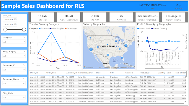
We can play around with different visualizations, and it is pretty intuitive. The Sample Project provided with the tool can be good reference for that. A few samples from that :


Even the visualizations can be overlapped on each other also.
Next we visit the Narrate canvas, where we can include a story / description of the insight, and on the presentation mode the story / description is displayed one after another.

I have tried to explain the same using a small demo as below.
If you like this demo and interested in similar videos, you can subscribe my channel LivingtheBI - Tilak

On other hand it seems Oracle's answer to Tableau and PowerBI Desktop. Anyways let's not get into the comparison between Oracle DVD, Tableau Desktop and Power BI Desktop. We will take that in a different post. The agenda for this post is to focus on Oracle DVD and explore various features of it.
To start with, to download Oracle DVD go to http://www.oracle.com/technetwork/middleware/bi-enterprise-edition/downloads/index.html
and download 'Oracle Data Visualization 12c'.

The installation is fairly straight forward. Once installed you can run it, and the home screen will contain all the projects created / saved.

The first step will be connecting to a DB source.

There are primarily 2 options, File and Connection.

And there are quite a few options for Connection Types.

To keep it simple let me take an excel file as a source. I have taken 'Sample Order Lines'.

On the left had side you can see the Attributes and Measures, which are determined based on the data type. The right hand portion shows the sample data, and various operations can be performed on each of these columns.

You can add multiple data source together also. Let me add 'Sample States' excel also.

Once added we need to check the relationship between them, by clicking the 'Source Diagram' option just below 'Add Data Source'.

Once the data, columns, measures etc are finalized it is time to create some visualizations. And for that click on the 'Visualization' tab.

We have the option to add a filter on the top.

I have selected a simple Bar chart. It is a simple drag and drop.

I add City in X-axis and # of Customers in Y-axis.

Furthermore I add a filter for Country = 'United States' for this chart, and Product Category in the Color, and change the chart to Stacked.

It needs to be saved as a Project.

We can play around with different visualizations, and it is pretty intuitive. The Sample Project provided with the tool can be good reference for that. A few samples from that :


Even the visualizations can be overlapped on each other also.
Next we visit the Narrate canvas, where we can include a story / description of the insight, and on the presentation mode the story / description is displayed one after another.

I have tried to explain the same using a small demo as below.
If you like this demo and interested in similar videos, you can subscribe my channel LivingtheBI - Tilak


No comments:
Post a Comment